Four simple accessibility improvements to apply today
Published on 04/02/2024
Last updated on 05/09/2024
One of the topics I've become most interested in since I first started branching into front-end development is accessibility. It's great to see that it's been getting more and more traction these last few years, but many websites and web apps are still largely unstructured to offer a great experience to folks who rely on screen readers and/or keyboard navigation only.
It takes great intentionality and active studying to learn all the little accessibility tweaks available to us in modern HTML and CSS, and even more so to apply them systematically to a project. So, to ease that just a tiny bit and maybe, who knows, help you make your website a bit more accessible, I thought I'd share a couple of the techniques I've applied to mine.
Aria labels
Every interactive element in the UI should have an accessible name. If we're talking about text-based buttons, the DOM automatically uses its string as the name via the aria-labelledby attribute. However, when it's a case of a button without text, we must intentionally add a name for it by using the aria-label attribute. That's what I did with the nav bar's dark and light mode toggle.
1
Focus-visible treatment
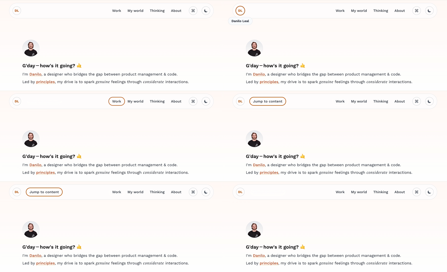
Folks navigating through your website using just the keyboard need to visually know which element they're currently focused on. We enable that by adding focus-visible styles to all interactive elements. You can apply any valid CSS under this pseudo-class, but the outline property is the most common as it mostly suffices to solve the problem.
"Jump to content" button
If you go to my website (or any website out there) and start pressing the tab key, the order in which elements will get focused starts from the top of the DOM tree. This means that, practically speaking, you'll have to go through all the nav bar items first before getting to the meat of your site's content. And, if you're a keyboard-only visitor, that can get cumbersome pretty quickly.
To ease that, we can add a “Jump to content” button as the first or second focusable item, so that if you start tabbing right after the site has loaded, you will jump to whatever element you deem “primary content”, skipping all navigation items.

I've done that by simply adding an id to the element I wanted to jump to and then adding that to the href of the button (which is actually rendered as an a tag).
1
Be aware of nested interactive elements
What made me add this last example is the card component that renders as an a tag that I have in many places on my site. Note how, in several instances of it, there's usually a call to action reading "Read the story" or something similar. These elements are added using the Button component I showed how to build in my previous post.
Technically speaking, though, the main issue here is that you shouldn't nest two interactive elements, as that's considered invalid HTML.
1
The tricky thing is that no visible error will pop up if you do that—you'll see your site render normally (unless you're using Next.js, which throws a hydration error). However, that can be very confusing for screen readers to understand what should be announced, particularly in the case of the example card, given that the button wouldn't fire any real action.
To solve this, I did a very light implementation of "component polymorphism". This Button component of mine is rendered as an actual button if I pass the button prop; otherwise, it's rendered as just a div, which is not interactive by default and, therefore, not focusable.
1
Closing thoughts
I love learning more about accessible HTML and CSS every single day, and I highly recommend you look into it as well! It will not only enable you to make the web better for more people, but also teach you a lot about design systems, component APIs, and, generally speaking, the importance of using the tools correctly.