The secret to minimalism is addition
Published on 20/04/2025
Minimalism has notoriously been a big goal for every designer since the "flat UI" era. It's generally perceived as a good thing because it creates focus and captures attention by reducing complexity and clutter. I like it, too. It's elegant, it definitely promotes a feeling of calm, and for the most part, it makes everything easier to use and understand.
However, the tricky part about minimalism is that it's just not an exercise in simply removing things. In fact, if you try to achieve minimalism by purely exercising removal, you'll probably have a very hard time getting there. It's very hard to build something that is really minimal and simple. It is always so easy to find everything important.
But that is exactly the catch. I'm starting to feel like this is the secret. It may be obvious, it may be dumb, but from my experience so far, the most effective way to get to minimalism is through addition.
The exercise
If you start by wanting to be minimal and clean for the sake of it, you'll probably leave critical things out. And actually, that is a frequent misinterpretation of what minimalism is: it's not about having fewer items. Rather, it is about intentional positioning of highly important items.
First, you'll need to reflect on what the most important thing is about what you're doing. For example, in product design, every UI usually has one clear goal (e.g., take the user to a certain place, allow the user to do X, etc.). Then, it's usually hard to find what is really critically relevant to achieving that goal.
The way to do that is to make everything present at first.
Start by putting all buttons, inputs, switches, and so on visible. Get to a point where you start to feel uncomfortable with the number of things at sight. This feeling will enhance your senses about what is truly relevant for what you're trying to achieve. Try to closely observe each and every single element. From whole big blocks of components to small UI decoration items, like borders and shadows. And then ask yourself:
Does everything I see here help fulfill the goal?
If the answer to this question is a confident yes, you probably have a minimal design.
Case in point
Over at Zed, we're currently running a private beta for our new Agentic Editing capabilities, which introduces a new Agent Panel. This example is super small, but it's one that illustrates the opposite of what you may expect out of a minimalistic effort.
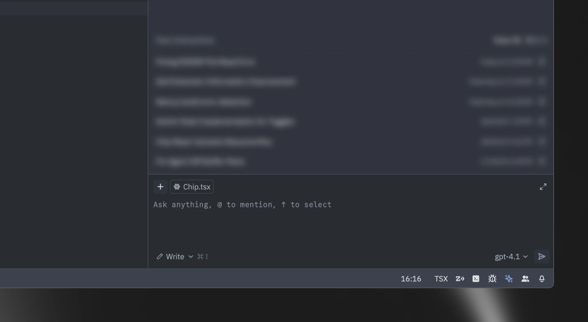
Previously, I had removed the icon from the model selector trigger. Much simpler UI, right? Looks cleaner. That's what I wanted. However... removing it just for the sake of visual simplicity made for worse design.
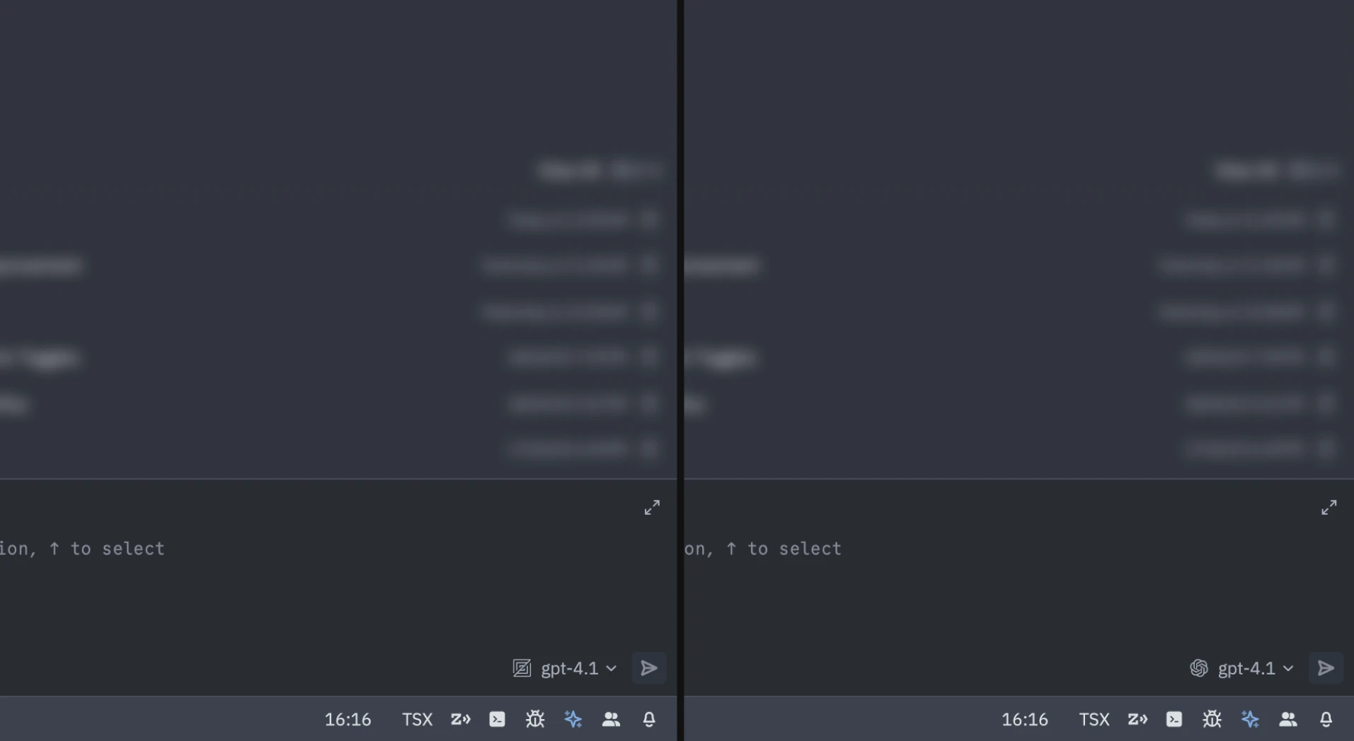
That's because the icon provides important information: the LLM provider, which is relevant for debugging and performance purposes. So... we put it back. Still minimal. And more useful. Now, we can see that on the left, "gpt-4.1" is provided by Zed. And on the right, it is provided by OpenAI itself.
In conclusion
It's funny to think about how sometimes minimalism can be about adding things. That's the true meaning of being minimal: intense intentionality.
When I look back at all the UI I've designed so far, I always bump into things I could've removed for the sake of focusing on the problem at hand. I guess that's part of the journey, and as folks say: if you look back at older designs and don't feel somewhat embarrassed, you're not growing. Happily, as weird as it may sound, I feel very embarrassed by all my previous work. Onwards!