Earning management experience
If a given team works on optimizing stuff, that team is either lucky or tired. Having the opportunity to work at the optimization level only happens once you have the foundations in place. We managed to get there after spending a bunch of time setting those structures up. We knew for a long time that anything we could do to help drivers take better care of their money would be helpful and well-received.
Managing income from multiple freelance gigs in a single month is a challenge many of us can relate to. For our drivers, who often use multiple ride-sharing apps, this challenge is amplified. Each app has its own payout system, and there's no centralized tool that can help them manage their earnings. This is the problem I set out to solve.
Every week, we saw a ton of tickets sent to the support team, asking when the next deposit would be made. New drivers didn't know how the payout system worked. Old drivers changed bank accounts fairly often and sometimes had typos that caused the deposit to be postponed. Several similar minor problems like these made the support inbox get flooded weekly. And, in the end, playing with money is a dangerous feat. Drivers got really mad whenever they didn't receive the money on the day they were expecting it. They had the right to be—who wouldn't?!
Trust levels were down, our support inbox had over 4k tickets when this initiative was prioritized, and the app’s Google Play rating was considerably affected because drivers also used its comment box to leave angry comments.

This is what we had prior to the initiative being prioritized. Nothing more. A list of payouts and a time filter.
Research & development
To better grasp what we were stepping into, I surveyed about 3.5k drivers. We already had the data points I mentioned above, but I also wanted to dig deeper and understand what their relationship with money was. Having quantifiable results was also a strategy for getting more buy-in to prioritize such a feature. It wasn't trivial to pull it off, so I needed to convince the leadership stakeholders.
The data we collected showed, as expected, that drivers are there for the basic stuff. They want to not be late on their rent, to have enough to buy food, and to have some savings in case their bike breaks. Very basic. I also used the survey to understand a little bit about their analytical habits. I wanted to explore how and when they stopped to check whether riding for our app was paying off.
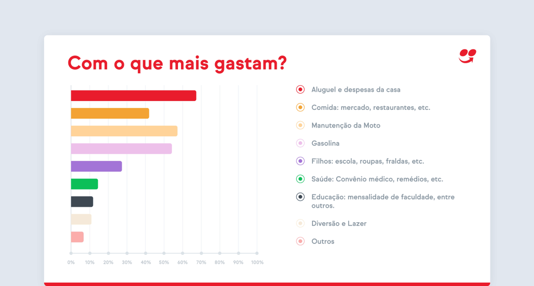
One slide of the deck I designed with the survey results. Here we see where drivers spend most of their money.
Designs deep dive
When a project proves to be very complex, it's common for people to deprioritize it and leave a lot of cool stuff out. This one was no different. I knew that pulling and organizing financial and performance data was going to be tricky. There was a lot of data modeling needed in order to display it on the UI. But I went all in to design a complete vision of what we could do. That was important to showcase potential and check whether we were on the right path.

I designed a three-tab structure for the performance feature: financial gains, promotions, and goals. A huge part of the driver's income was how many promotions they were able to complete by the end of the month. iFood used to offer a bunch of driver promotions whenever demand was scarce, such as on rainy days. These were opportunities to earn a little extra. And drivers got very lost, not knowing which promotion they completed, or why one they thought they had done ended up not paying out. That's what the Promotions tab was for.
On the financial gains side of things, I focused on providing more data about a given payout and also made sure to be very clear about when that money would reach their account. Drivers would be able to filter between multiple time periods, check additional stats about a given time frame, and also see the payout status.

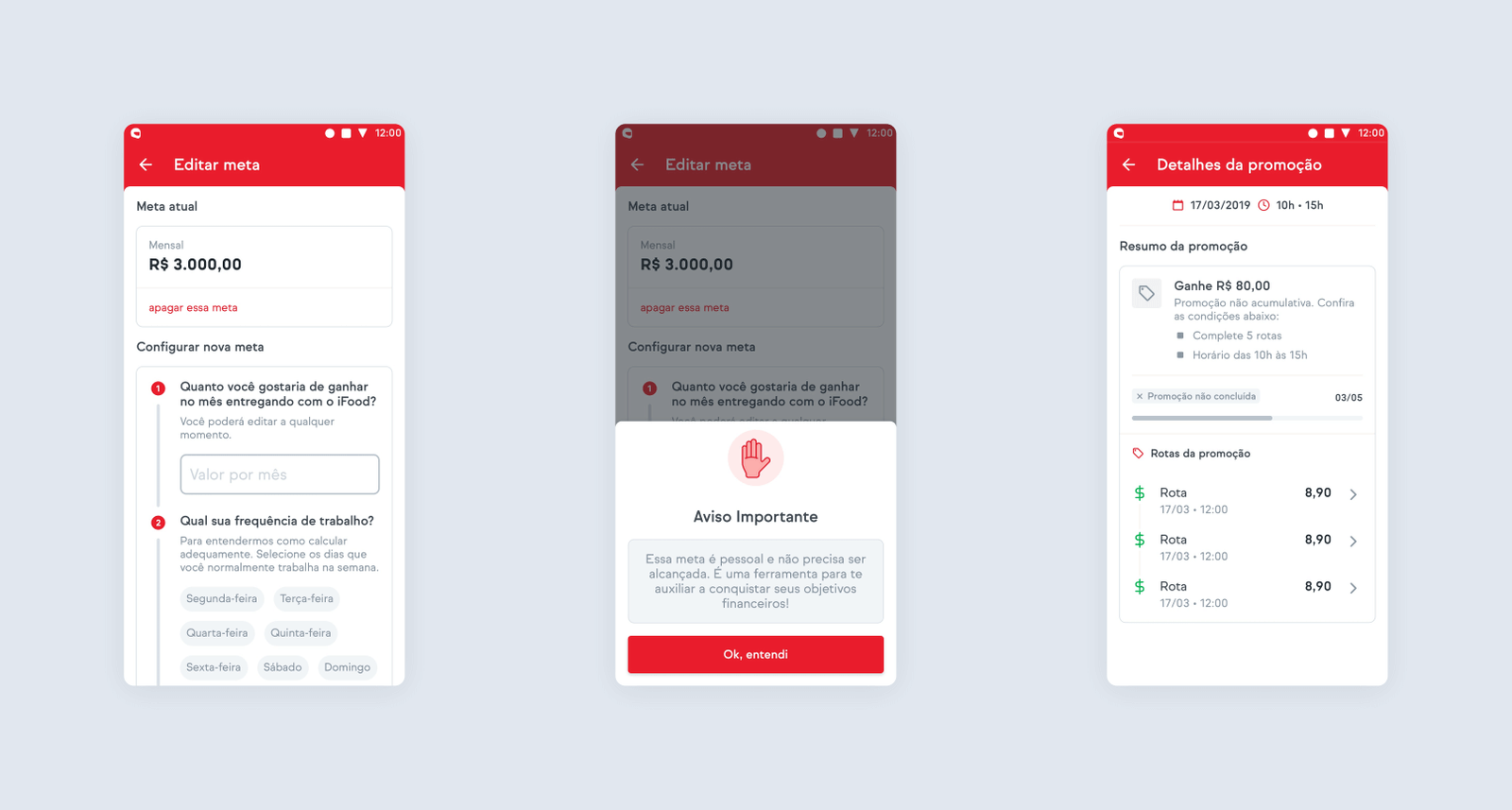
Lastly, the goals feature—which you see in the screenshots above—was something I really wanted to provide. I thought this would help drivers organize themselves around a certain goal. We knew from research that they already did that in multiple, loose ways. If we provided this experience inside the app, we would've probably made the whole process much more efficient. We knew that drivers woke up with a certain goal in their heads.
Whenever they hit that, they'd stop working—time to rest. What if the app could communicate with them about this? That was the design goal. You can check the full prototype here if you want.
Wrap up
Unfortunately, this project wasn't rolled out before I left the company. We did, though, convince stakeholders that this was important enough to wrap the team around doing it, which was a great thing. The designs seemed very strong; they were in sync with what we learned from research, and the whole argument was also very sound. I was glad to see this being slowly rolled out a few months after I left. Even though the design changed here and there—which is natural—the core idea persisted, which reassured us that we were on the right path!