Designing the core delivery flow
Loggi started out as an on-demand driver pickup service. The classic use case was: you're at the airport, right about to board. But you've just realized you left your passport at home. That's okay; call a Loggi driver, and they'll pick up the keys to your place from you, go there, and bring the passport back.
You can obviously tell how challenging a product like this is to pull off, right? So, by 2019, Loggi had already explored multiple routes to pivot the product significantly. E-commerce deliveries were right at the door and definitely signaled a concrete and stable way into the future. So, that year saw Loggi heavily invest in multiple distribution centers and an extensive network of transportation partners across continental Brazil.
Rightfully so, that prompted a major re-org, which made me move from the team I had originally been assigned to. My focus would now be on generalizing the driver experience for this new reality.
From the old to the new
While the app was already somewhat generic, up until that point it was still mostly tailored to the old product reality. When I joined the team, there was already a rewrite in progress, where folks were ditching React Native and going with a native shell with a PWA approach. This new app version was called Loggi Leve, which resonated with the idea that it'd be a much lighter, simpler version of the whole model.
My contribution was mainly to help design a version of the app that was generic enough that we'd be able to deploy it to multiple delivery-related contexts, including various types of route anatomy and supported vehicles.
Some of the UIs from the legacy app. We migrated from React Native to a PWA powered by Material UI.
Research & development
The team and I really put effort into understanding how the entire last-mile operation worked. Having precise knowledge about all of that would help us immensely understand what the primary flows we'd need to prioritize for the first refreshed version were. We eventually scoped down to the obvious parts: onboarding, pick-up, and delivery. These were the bits of the app we had to nail down incredibly well—everything else would follow.
It's hard to list how many teams were involved during the research process. We had constant check-ins with operations, CX, commercial folks, and others to ensure we were designing with all of the requirements and constraints in mind. Lots of back and forth, frequent trips to distribution centers, prototypes, and focus on the details. We also wanted to take this opportunity to bring Loggi to a new level of design quality.
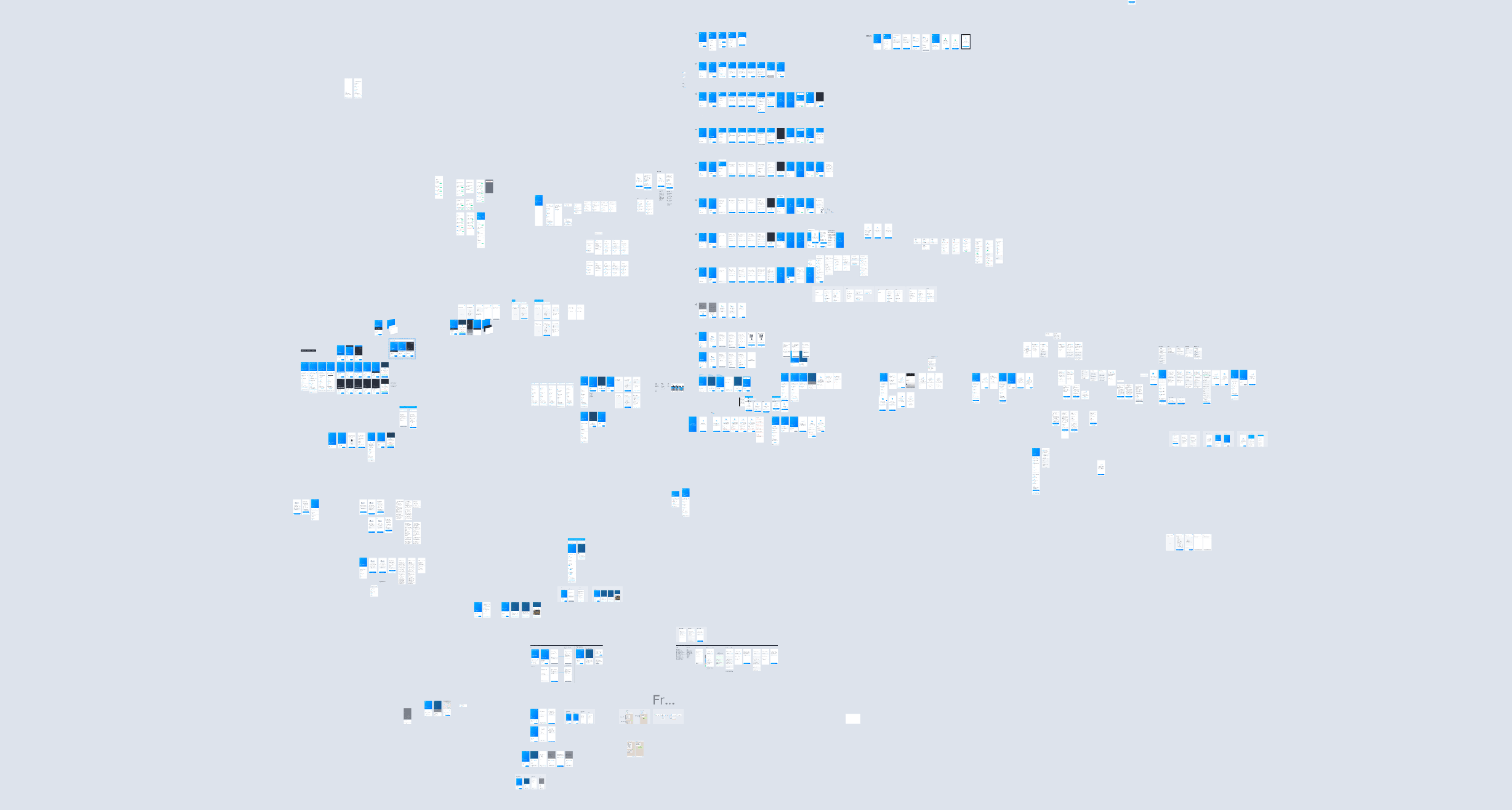
Extreme zoom-out of a portion of the designs.
Wrap up
The design process and research took about 4 months, and the rollout alone lasted 3 months, with so much back and forth to get everything out. We couldn't afford a minute of downtime—really sensitive stuff.
It was truly a lesson in working iteratively and making little incremental progress, one step at a time, until we completed the migration. The pandemic happened in the middle, which was a huge bummer, as we couldn't be down there on the streets talking with the drivers face-to-face about how the experience was turning out. The numbers did tell a good story, though, and it was super nice to see Loggi enter a new chapter in terms of driver infrastructure.
Designs deep dive
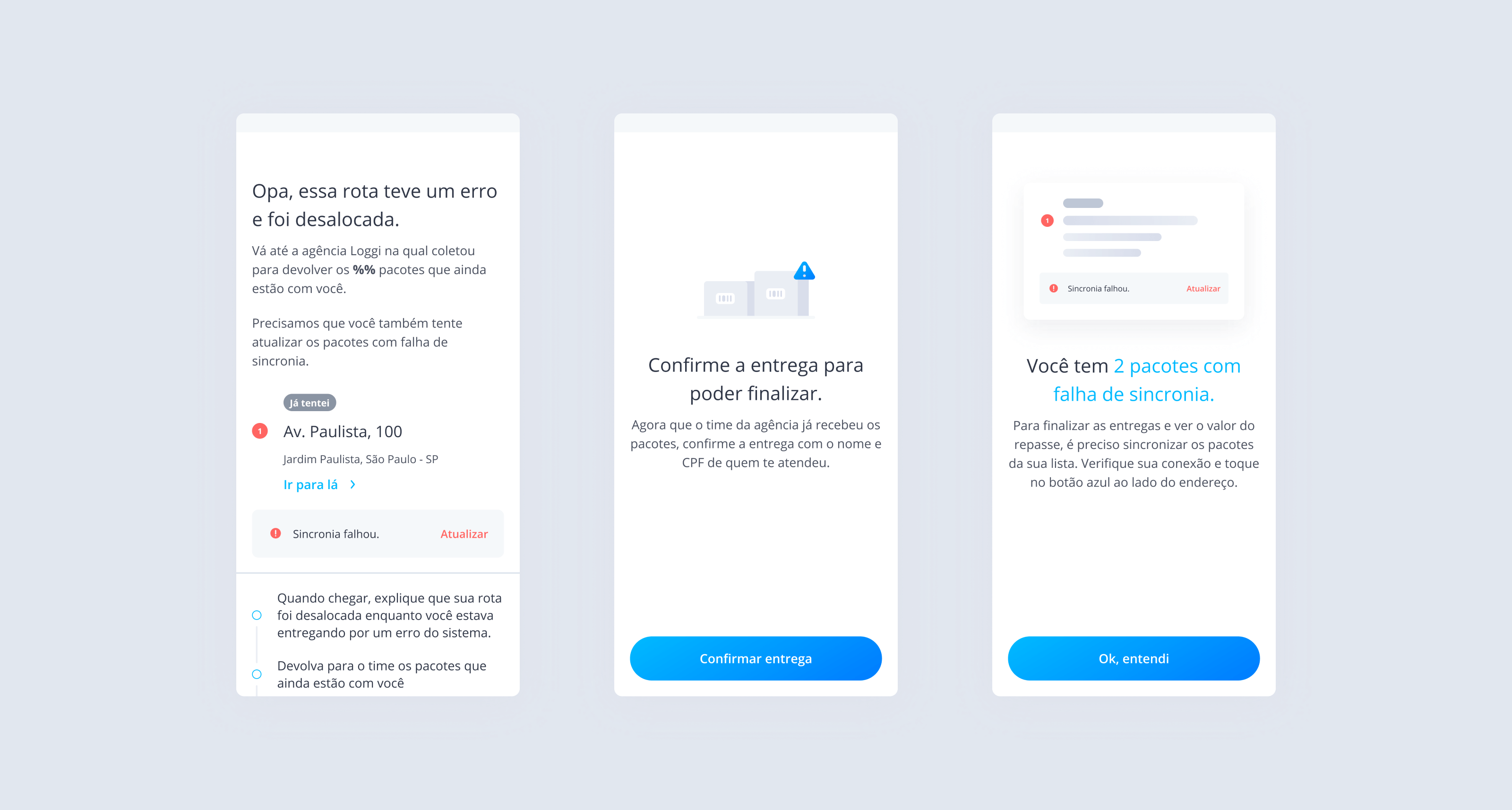
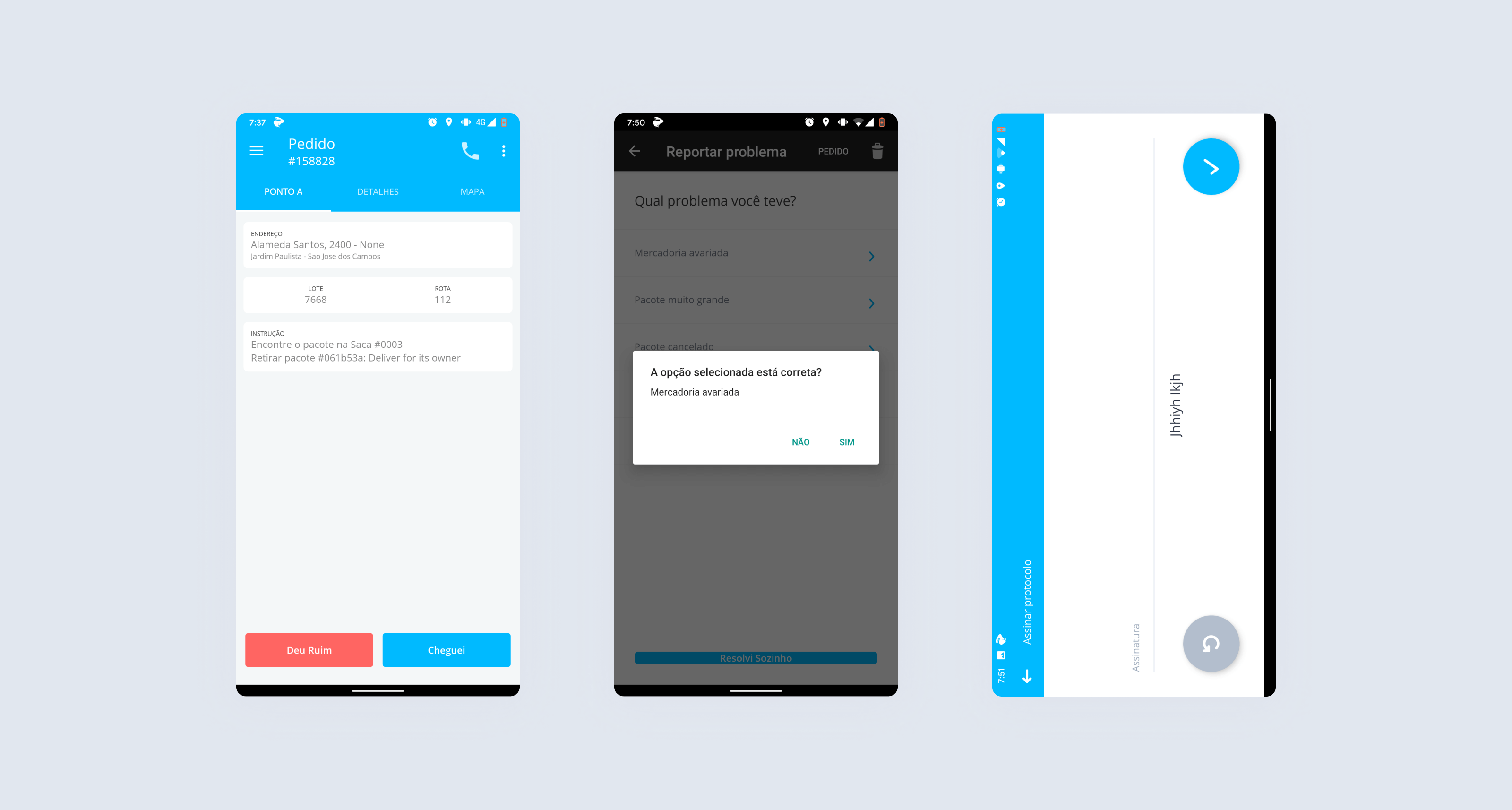
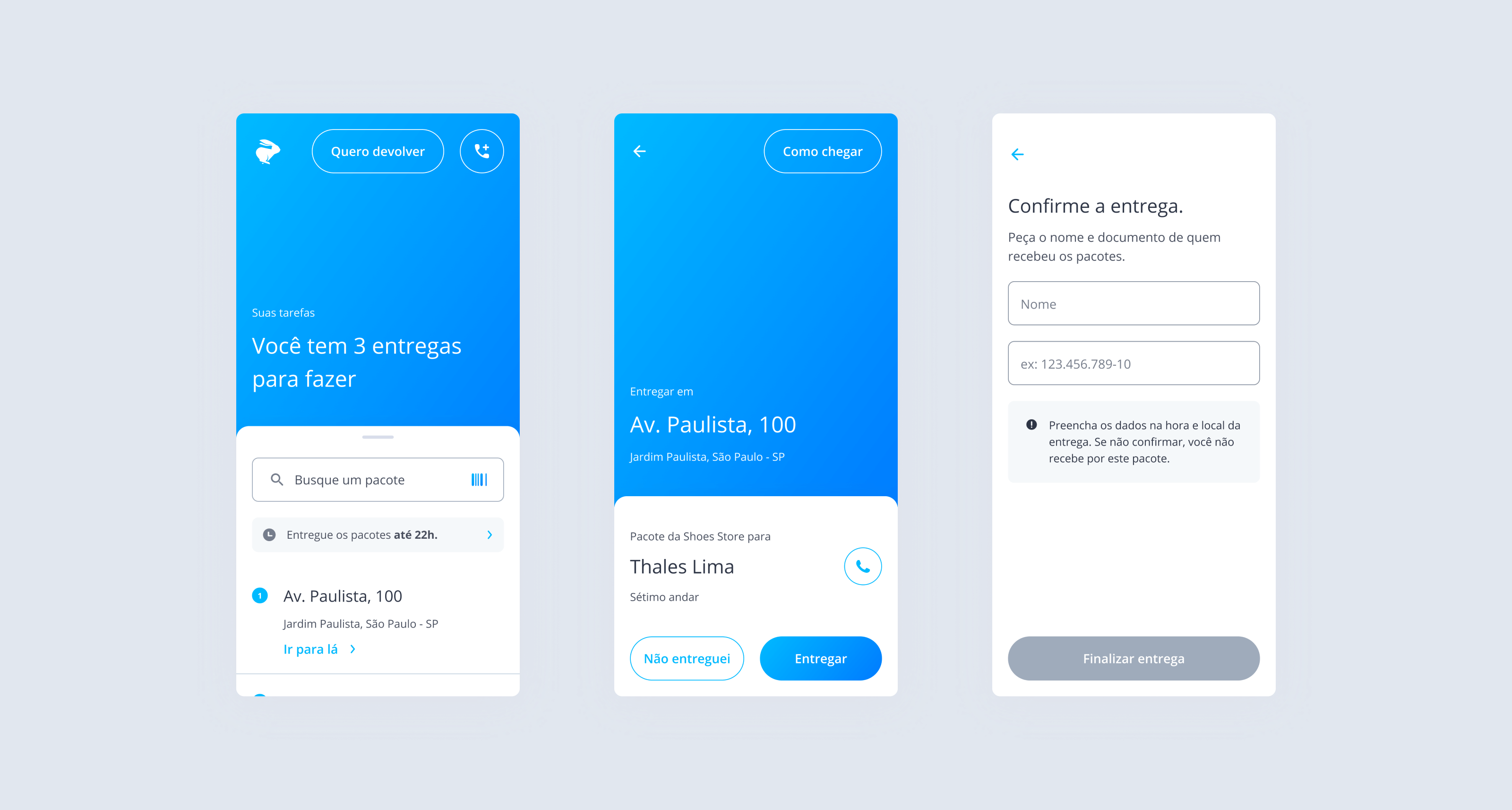
These were the main pieces of UI we delivered. That's the driver's cockpit, where they can see all the packages available for delivery in a given route, as well as go into each package's details and confirm the delivery. It's one of those designs that look a bit too simple but are incredibly hard to pull off.
We tackled long-standing problems that bugged everyone, but no one ever had the time to work on. Among the things we optimized: how drivers reported problems during delivery (which helped a lot with data analytics), how drivers updated the status of a delivery, removing geofencing, and making the product reliable and workable even without a connection, and how drivers got help during emergencies—which was something brand new that I'm proud to have contributed to.
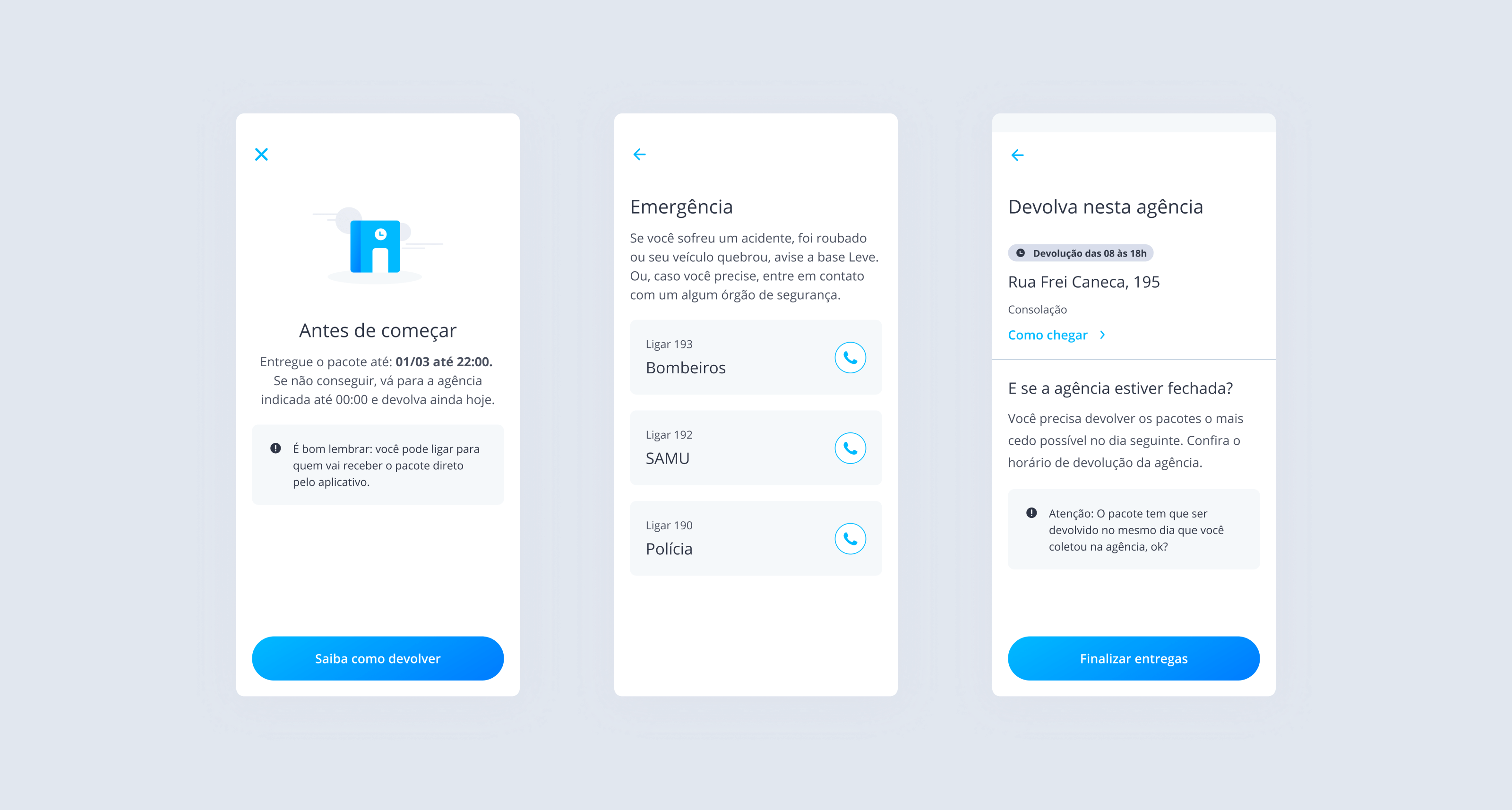
Big text elements, not a lot of fluff, and really straight to the point. We wanted to hone in and be incredibly simple, but still informative and modern.